Cabinette

thronobulax

Very Active Poster
Registered User
Joined
Aug 29, 2020
Messages
1,359
[Feb. 2004] Cabinette

1786134362655.jpeg

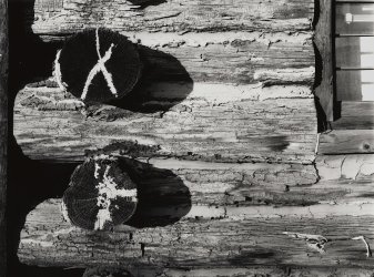
Wisner 4x5 Technical Field, 150mm f/5.6 APO Symmar, Bergger BPF 200, HC-110B, scan of silver print.
 
This is a scan of a workbook print I just made. This is a multi-year, and now almost complete project to revisit all my old negatives. I have gone through something between 8-10,000 monochrome negatives (50+ years worth) and selected which ones to print (or reprint) in 8x10 as workbook images. My printing experience and much better VC technology has made images I thought to be dreck, rather wonderful in this process.

This is a sort of first pass at a "Best Of" attempt which will be significantly whittled down further to determine which ones deserve larger printing and all hanging (the prints, not me!).

I keep favorites from the workbooks here (the first whittling):

 
Last edited:
This is a scan of a workbook print I just made a multi-year, and now almost complete project to revisit all my old negatives. I have gone through something between 8-10,000 monochrome negatives (50+ years worth) and selected which ones to print (or reprint) in 8x10 as workbook images. My printing experience and much better VC technology has made images I thought to be dreck, rather wonderful in this process.

This is a sort of first pass at a "Best Of" attempt which will be significantly whittled down further to determine which ones deserve larger printing and all hanging (the prints, not me!).

I keep favorites from the workbooks here (the first whittling):


Some beautiful photo's there, thanks for sharing. I enjoyed looking through those, some stunners with beautiful tonality.
 
Some beautiful photo's there, thanks for sharing. I enjoyed looking through those, some stunners with beautiful tonality.

Thanks for the kind words. Very much appreciated.

Every format from 35mm, 645, 6x6, 6x7, 6x9, and 4x5 is represented there. All are scans of 8x10 prints, not negatives and have been adjusted on a more-or-less calibrated monitor to try to represent the print faithfully on a computer screen.

I am happy to answer questions of materials, film, developer, location, camera, lens etc. should you (or anyone) want to know.
 
I'm curious about the following;
Firstly, your motivation and criteria for image selection.
And secondly, how to make a coherent body (bodies) of work?
 
I'm curious about the following;
Firstly, your motivation and criteria for image selection.
And secondly, how to make a coherent body (bodies) of work?

The criteria is what I like and what moves me, nothing else.

Not everything in the workbook is particularly good. I kept some things in there as reminders of some technique or another I was trying or a different developer or film or ...

I am not much compelled to produce formalities or rigor of a portfolio, coherence being but one example. Again, my sole purpose is to chase my own aesthetic wherever it may go. The only sense in which there is coherence, is that those images are in chronological order.

Some of the images in that workbook site are atavisms that take me back to a time or place. Some are expressly intended to look for a particular aesthetic - street, landscape, abstract, etc. Some are simply exercises - the photographic equivalent of playing scales or learning via etudes - that ended with a happy (to me) outcome.

I may someday get more serious about organizing all this stuff, but in the mean time, I'm having way too much fun shooting new images, developing the film, and printing traditionally.

If I have any credo it is this:

  • Art is for the artist not primarily the audience
  • It is produced at the intersection of technique, mechanics, and worldview, with the latter being the most important
  • Good, and possibly great work comes from lots of work. After 50+ years my hit rate is 2.5-3.5%
  • Use any and all excuses to take more pictures - new equipment, a different lens, a new way to do darkroom magick, etc.
  • So ... never stop shooting and working

This weekend it will be a new-to-me Leica M3 that will help my wanderings :)
 
Last edited:
Thanks for the kind words. Very much appreciated.

Every format from 35mm, 645, 6x6, 6x7, 6x9, and 4x5 is represented there. All are scans of 8x10 prints, not negatives and have been adjusted on a more-or-less calibrated monitor to try to represent the print faithfully on a computer screen.

I am happy to answer questions of materials, film, developer, location, camera, lens etc. should you (or anyone) want to know.
Thanks for the offer !

Could you talk me through the photo of the large white ice cream parlour at the side of the river, the metering and dynamic range on that scene is awesome, the shadows under the floor and the pilings there are great, as is the shadow under the roof and the roof next door, I don't think I have ever seen such brilliant white like with that detail yet maintaining superior shadows, I want to know everything, film camera lens, metering , developer and time, print paper and exposure. It's a wonderful shot. I can even see through the blinds and into the shop.
 
Thanks for the offer !

Could you talk me through the photo of the large white ice cream parlour at the side of the river, the metering and dynamic range on that scene is awesome, the shadows under the floor and the pilings there are great, as is the shadow under the roof and the roof next door, I don't think I have ever seen such brilliant white like with that detail yet maintaining superior shadows, I want to know everything, film camera lens, metering , developer and time, print paper and exposure. It's a wonderful shot. I can even see through the blinds and into the shop.

Can you please click on that image and then the "i" icon to get the exact exposure number, and I'd be please to honor your request.
 
Last edited:

"Ice cream parlour" threw me. But I think you mean this image:


(It is actually an ice house for fishing boats.)

This was shot earlier this year in Naples, Florida in the US in a docking area called "Tin City".

It was taken with a Leica M5 and 35mm f/2 ASPH Summicron, almost certainly with an orange filter.

The image was exposed on Lucky SHD 100 at full box speed but reduced 2 stops for the orange filter factor. So the actual EI used was 25.

The M5 has a spot-metering-ish system but I do not recall exactly how I metered. Either I metered for the shadows and decreased the exposure from the reading by 2 f/stops or I metered for the bright wall of the building and increased the exposure from indicated by 2 f/stops.

The real trick to holding this range came from the film development. The film was developed in Pyrocat-HDC 1.5:1:250 . After an initial 3 min of prewet in water, I used a semistand development scheme: 1 min continuous agitation, rest, 10sec agitation at 16 min, rest, remove from developer at 30 min.

The long development time gives the shadows time to fully develop and also expands mid-tone contrast. The high degree of dilution caused the bright highlights to exhaust quickly (because we are not agitating very much) and this holds the wall in bounds.

Note that the Pyrocat staining also serves to mask grain somewhat, which is rather helpful with 35mm especially.

The print was made on Fomabrom Variant 111 VCFB using split VC technique. First the paper was exposed for the highlights with the soft filtration on the enlarger, then exposed a second time with hard filtration for the shadows. (The VC head is a Heiland LED 4x5 model mounted on an ancient Omega DII.) After fixing and a short wash, the print was toned in Kodak Rapid Selenium Toner 1+40 for somewhere around 3-4 min, and then fully washed.

The dry, flattened print was than scanned with VueScan on an Epson V800. Post production was on a more-or-less calibrated monitor using GIMP to try to get a digital image that was a close to the print as possible.

If this isn't the image you had in mind, please identify it and I will respond accordingly.
 
Last edited:
I don't think I have ever seen such brilliant white like with that detail yet maintaining superior shadows,

One other comment is in order here.

The reason you largely don't see this is because of the way we all learned Zone System (or the equivalent). We were taught to decrease EI and really decrease development time (so-called N- development) to hold dynamic range. This does work, but it does so at the expense of the microcontrast in the middle tones. This makes the image look dull and lack "snap". The overall sense of brilliance you're seeing isn't just from the highlights and shadows, it's because the middle tones are nicely separated due to the long development time.

Unfortunately, high dilution, low agitations schemes can be painful to get right. How painful? I spent the better part of half a decade figuring out how to make it repeatable (and fending off the naysayers). Although slightly out of date now, my notes in the matter can be found here:

 
The brilliance of the white has nothing to do with the separation of the mid tones. It is because it is actually white and has maximum contrast with the abundant deep black of the shadows.
 
All this must be subject to the usual provisos on monitor differences.

The white planking isn’t paper-based white, as you can see where it meets the “ICE” sign. I would tentatively suggest a different explanation.
The image very successfully recalls the experience of seeing things in brilliant sunlight and it’s an unconscious memory of this that influences what we believe we are seeing.
 
All this must be subject to the usual provisos on monitor differences.

The white planking isn’t paper-based white, as you can see where it meets the “ICE” sign. I would tentatively suggest a different explanation.
The image very successfully recalls the experience of seeing things in brilliant sunlight and it’s an unconscious memory of this that influences what we believe we are seeing.

The negative actually is somewhat higher key than you see in that print scan. I printed down the highlights somewhat with VC soft light so as to not loose the detail of the clapboard on the side of the building.

These days, "paper white" isn't an unambiguous thing. When buying paper for a laser printer, I take note if its "brightness" rating. White isn't white isn't white, I guess ;)
 
Last edited:
Indeed you're right, but on-screen it's rather hard to tell the brightness of the paper base. The small difference between the white paint and the Ice sign remains.
Nevertheless, this print seems to recall the sensation of looking at something in bright sunlight. One almost screws up one's eyes.
The same tone on a different subject - let's say a piece of paper on a desk - wouldn't arouse the same reaction even if the print's tonal range was similar.
 
The brilliance of the white has nothing to do with the separation of the mid tones. It is because it is actually white and has maximum contrast with the abundant deep black of the shadows.

You may be misunderstanding my point. The very long, dilute, minimal agitation scheme gives you full shadow speed and reigns in the highlights in a big SBR scene like this. But is also expands mid tone contrast.

If you look at the gray roof on frame right, you'll see that there are many variations of gray. It is this mid tone contrast that gives most prints their "snap" not just the overall image contrast. David Kachel (no fan of semistand development, BTW) has written in some depth and with considerable detail on the primacy of the middle tones. I believe you can find his monograph somewhere on line.

Zone System would have had me reduce EI, and then reduce development time (so-called N-1, N-2 ... processing). This does hold the highlights and keeps the shadows, but it absolutely smashes the mid tones. The aforementioned roof would just be a grey blob without those fine distinctions.

I have seen many otherwise nice images shot in a big SBR that use contracted development that end up looking uninteresting because the middle tones are all muddied together. I know this because I did it - a lot - when I used Zone System exclusively. I have lots of trees in forest images shot like that, that are absolutely terrible thereby.
 
Indeed you're right, but on-screen it's rather hard to tell the brightness of the paper base. The small difference between the white paint and the Ice sign remains.
Nevertheless, this print seems to recall the sensation of looking at something in bright sunlight. One almost screws up one's eyes.
The same tone on a different subject - let's say a piece of paper on a desk - wouldn't arouse the same reaction even if the print's tonal range was similar.

Yeah, this is the bane of digital mediia. I have a very good calibrated monitor that I use for editing but there is no guarantee you'll see what I put out there ;)
 
"Ice cream parlour" threw me. But I think you mean this image:


(It is actually an ice house for fishing boats.)

This was shot earlier this year in Naples, Florida in the US in a docking area called "Tin City".

It was taken with a Leica M5 and 35mm f/2 ASPH Summicron, almost certainly with an orange filter.

The image was exposed on Lucky SHD 100 at full box speed but reduced 2 stops for the orange filter factor. So the actual EI used was 25.

The M5 has a spot-metering-ish system but I do not recall exactly how I metered. Either I metered for the shadows and decreased the exposure from the reading by 2 f/stops or I metered for the bright wall of the building and increased the exposure from indicated by 2 f/stops.

The real trick to holding this range came from the film development. The film was developed in Pyrocat-HDC 1.5:1:250 . After an initial 3 min of prewet in water, I used a semistand development scheme: 1 min continuous agitation, rest, 10sec agitation at 16 min, rest, remove from developer at 30 min.

The long development time gives the shadows time to fully develop and also expands mid-tone contrast. The high degree of dilution caused the bright highlights to exhaust quickly (because we are not agitating very much) and this holds the wall in bounds.

Note that the Pyrocat staining also serves to mask grain somewhat, which is rather helpful with 35mm especially.

The print was made on Fomabrom Variant 111 VCFB using split VC technique. First the paper was exposed for the highlights with the soft filtration on the enlarger, then exposed a second time with hard filtration for the shadows. (The VC head is a Heiland LED 4x5 model mounted on an ancient Omega DII.) After fixing and a short wash, the print was toned in Kodak Rapid Selenium Toner 1+40 for somewhere around 3-4 min, and then fully washed.

The dry, flattened print was than scanned with VueScan on an Epson V800. Post production was on a more-or-less calibrated monitor using GIMP to try to get a digital image that was a close to the print as possible.

If this isn't the image you had in mind, please identify it and I will respond accordingly.

Thanks for that detailed explanation, you have got the best out of the scene with that methodology and process. Is it a generic procedure or have you investigated it specifically for that film.
 
The procedure generalizes for pretty much any film.

Lucky was actually the last of many films I've processed this way.
 
What can you tell me about your shot titled "pecking order" with the legs and pigeons in front of the Bodleian Library, Oxford? Were you living in Oxford or visiting? Any other shots from Oxford you want to share? Thanks.
 
Back
Top