How Would You Tackle This

Ian-Barber

Admin
Registered User
Joined
Aug 6, 2016
Messages
1,586
With a Grade 2 filter, to get the exposure for the blacks is 8 seconds but at 8 seconds, the light coloured sky and water is going to dark (greyish).

How would you tackle this scenario?
 
I will try a high grade Alan. Still trying to get my head round these filter Grades
 
sometimes dodging and burning is also needed

I agree. Because of the contrast difficulties, as encountered by Ian, darkroom printing is often seen as an activity where the objective is to match the contrast range of the negative to the "correct" contrast filter grade. It isn't of course. The objective is to come up with a good print. Simply finding the "correct" filter grade may result in a print that looks ok, and offends no-one - a politically correct print. But a better print might result if you choose a contrast grade that makes the main subject of the print look good. This print may then have blocked up shadows, which will have to be held back, and burnt out highlights, which will have to be burnt in. Dodging and burning. as Martin says.
This often happens in printing landscapes, where a low contrast grade may get you plenty of detail in the sky, but not enough contrast in the land. So you print at a higher grade to get the land right, then burn- in the sky.

Alan
 
This often happens in printing landscapes, where a low contrast grade may get you plenty of detail in the sky, but not enough contrast in the land. So you print at a higher grade to get the land right, then burn- in the sky.

Is this the norm?. What I mean is ... Always get the land right and then concentrate on the sky ?
 
It would be helpful if we could see an image. Impossible to give useful advice from filter numbers. Your "greyish" might be someone else's perfect.
Alan's advice seems entirely reasonable but should have been tried already.
Ian's statement of general principles is really excellent.
The answer to the specific question: "How would you tackle..." is that I'd try different filters and exposures systematically until I got it right. Quite a lot of test strips. I'd anticipate dodging and burning as a matter of course. As Alan points out, there's a difference between a print that matches the paper grade to the negative and an expressive image that gives delight.
 
Is this the norm?. What I mean is ... Always get the land right and then concentrate on the sky ?
Ian there is no norm. Printing is a creative process. It's not like baking a cake, where you follow a recipe. In printing photographs there are no rules, just your own judgement. A piece of cake!

Alan
 
We seem to be overlapping.
There is no norm. Every print is different. Get the important parts right. Sometimes the sky is important, sometimes the land. It might be a single tree or a building within the landscape. In a portrait, the face would usually be the important part but not all portraits include a face. There is a certain skill in choosing where to place the test strip. I fear there is no easy road.
The more enthusiastic advocates of the Zone System and Recreational Densitometry may seem to suggest that simply getting a precisely exposed and processed negative will guarantee a perfect print. This has not been my experience and I believe it's not the experience of many others. I may be either too sloppy or too ambitious, of course. Both are credible explanations
 
Ian there is no norm. Printing is a creative process. It's not like baking a cake, where you follow a recipe. In printing photographs there are no rules, just your own judgement. A piece of cake!

Alan

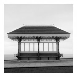
Yes, I fully understand that concept. In the darkroom, I often freeze when faced with a situation which requires trouble shooting. Here is the scanned and edited rendition of the scene I was referring to in the initial post.

Whitby-Bus-Shelter-1.jpg

I find getting to where I want to go with a digital file fairly easy most of the time but in the darkroom, a real challenge. This is only down to lack of experience. I think a hands on workshop maybe in order in the near future.
 
That looks fine to me, on this screen. A little more contrast in the shelter might be good, but that's a personal preference. (The decorative edge to the roof a little brighter, perhaps?) I see nothing wrong with the sky, but if I were printing, I'd burn in a graduation from the top very, very slightly and I might darken the road a little.
Other members may have different and much better advice.
I'm afraid there's no short cut to darkroom printing. You have to make the mistakes.
If you follow your digital route on a print and then look at History, every single entry there would be a new test strip or a new print. It can be daunting. Some prints can take a whole day (or a whole night) to get right, but fortunately this is not normal.
A while ago, there was an exhibition of AA's early work. You are already a better printer than the 'prentice AA, so take courage.
 
Ian, I'm not sure what I am looking at here. Is the image (taken at Whitby?) a scan or digital photo of your darkroom print, or an image of what was produced by scanning the negative and working it up in, say, Photoshop?

Alan
 
Even sometimes you have to find a better day for taking the image.
Well, if there is nothing really dramatic in the sky than it's only a shade of grey.
If it's the shelter which is the only important part of the image I'de make a couple of different versions on paper an see how it works for me.
I use different papers, PE and Baryt, warmtone and coldtone, very often it ends on baryt toned in Selenium, so one negativ gives me tons of versions.

I think this one needs a splitgrade printing .
 
Ian, I'm not sure what I am looking at here. Is the image (taken at Whitby?) a scan or digital photo of your darkroom print, or an image of what was produced by scanning the negative and working it up in, say, Photoshop?

Alan

This is a scan of the negative and processed in Photoshop. this was my vision when I took the Photograph at Whitby. In the darkroom, the sky is going to grey for how I want it. I thought about trying to hold back the sky but the individual windows may have created an issue.
 
looking on the details of the roof and surrounding elements the negativ and the scan looks good except the dull sky.
Would you mind to scan the print?
 
Martin's idea of doing a series of prints is a good one.
One other thing to consider is that you are very close to the time of making the negative. Memories of the actual scene can cloud your judgement of what the print should look like.
 
Ian, don't let Multigrade filters faze you. They work according to a set of rules. You just need to find out what these rules are. A simple exercise will reveal all! This is best done when you have just made a nice print on a middle filter grade.
Let us assume that you have just made a reasonably nice print with details in the highlights and shadows and perhaps small areas of full black and paper white. It was a straight print - with no burning-in or dodging- at 10 seconds on Grade 3.
Begin by swapping the filter for a Grade 2, and make another 10 second print. Now compare it to your grade 3 print. Be systematic. Look first at the highlights, then the shadows. You will see that the highlights have gone darker, and maybe there is no longer any paper white. But the shadows have gone lighter than they were, and maybe there is no longer any full black.
Now swap for a Grade 1 filter, and make another 10 second print. The highlights have gone even darker now, and the shadows even lighter.
Now swap for a Grade 0 filter and make another 1 second print. The progression continues. Even duller highlights, and shadow areas much lighter than they were on the Grade 3 print.
Now go the other way. Swap for a Grade 4 filter. Now you will have to double the exposure to 20 seconds, to stay consistent. Compare the highlights with the Grade 3 print. Slightly paler, with more paper white. Now look at the shadows. Slightly darker than on the Grade 3 print, with less detail and more full black.
Now switch to a Grade 5 filter and make a 20 second print. The highlights have gone to white paper now . The shadows are even darker than they were with more full black.

Wash and dry the prints and spread them out in order from 0 to 5. The progressive changes will be obvious now. The Grade 0 print will have a limited tonal range, from darkish grey to light grey, with all the separate tones compressed, and will look very dull. The Grade 5 end of the scale will look completely different. All the tones will have been stretched out, and the upper tones lost to blank white, and the lower tones lost to full black.

Now for the best bit, which will teach you something really useful when making future prints. LOOK AT THE MID-TONES. Find something in one of the prints that has a certain mid-tone. Now look at that same thing in all the other prints. They all have the same tone! You may have to seek it out, but once you find it, it will be obvious. For a same given print exposure the mid-tone doesn't change across the grades. It stays the same from Grade 0 right through to Grade 5. A Grade 0 filter compresses the upper tones down to this mid-tone, and compressed the lower tones up to it. On the other hand, a Grade 5 filter does the opposite. It stretches the upper tones up and away from the mid-tone, and stretches the lower tones downwards and away from the mid-tone.

This exercise doesn't take long to do, and will show you a lot about how filters work. If you have room in the darkroom you can pin the prints up and they will show you the way forwards when you have a test strip in your hand and are unsure about what to do next.

Alan
 
Thanks David.
I should have said that what I described will only happen if you are using an enlarger bulb with a colour temperature of about 2700K, as this is the colour temperature that Multigrade filters are designed for - as I understand it.
What I described was what I got with a traditional incandescent pearl enlarger bulb. Then I repeated the exercise using an LED bulb rated 2700K and got exactly the same result.
A fluorescent light will give completely different results.

Alan
 
Yes indeed. I think it's good advice anyway.
The niceties of colour temperature are for assured and advanced workers.
It's getting a visual grasp of the differences between grades that's important – the "feel" of them, if you like. After all, we print by eye, not by numbers.
I have a cold-light head on my other enlarger and Ilford recommend installing a yellow filter permanently before using Multigrade. I forget the exact value.
 
Back
Top